|
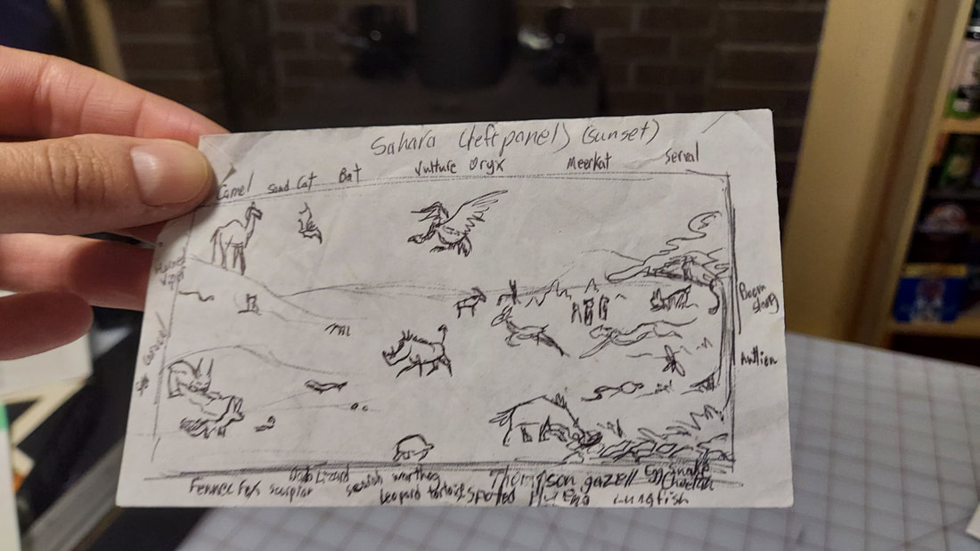
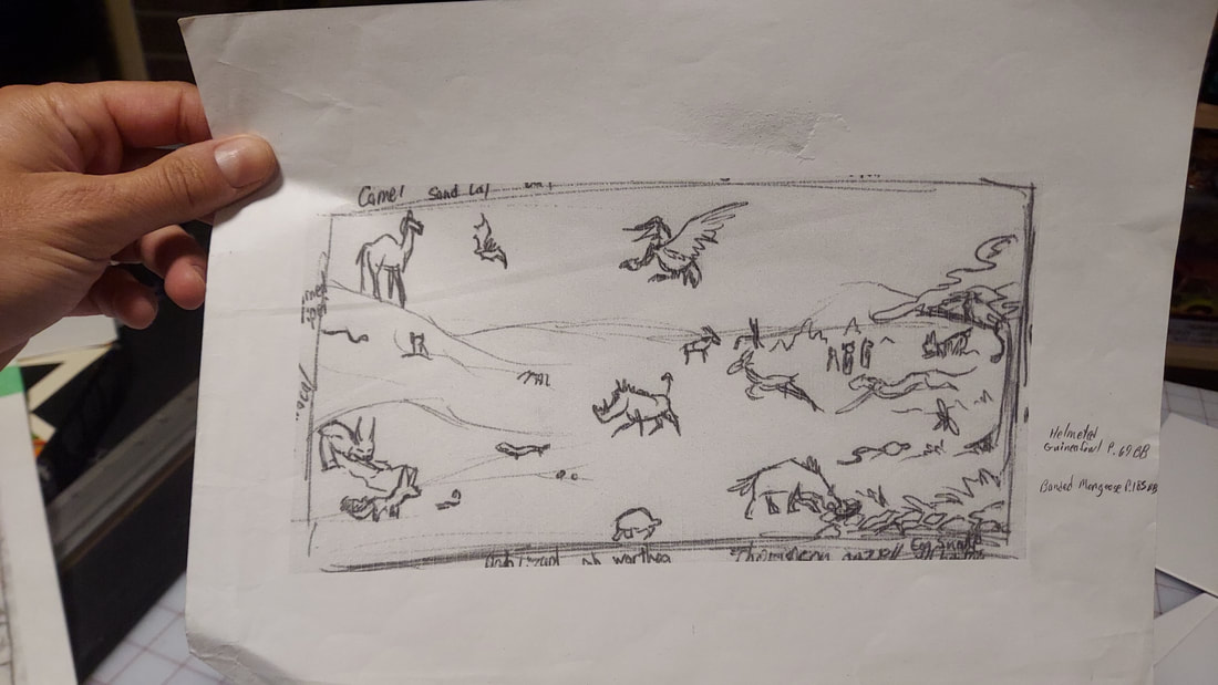
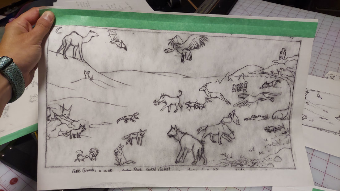
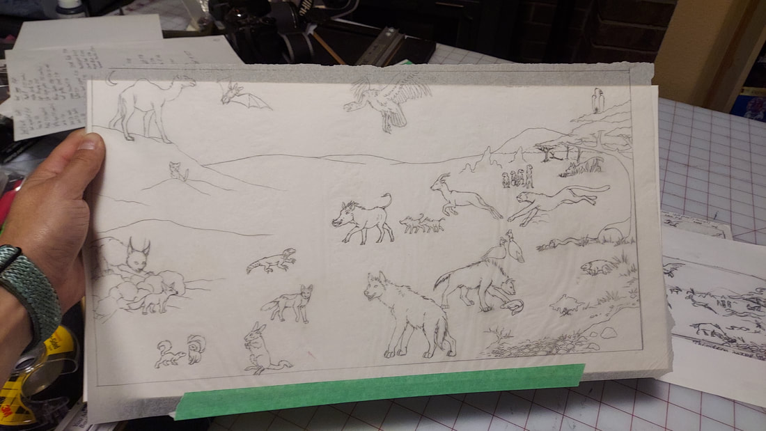
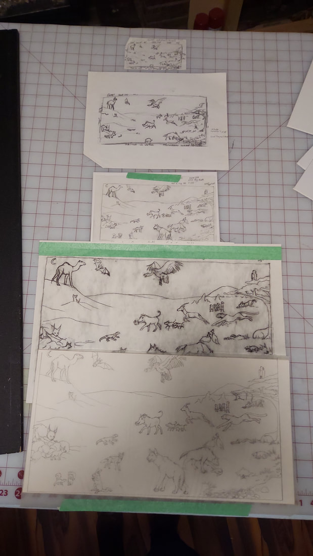
by Sarah Silverman-Pucci Sarah Silverman-Pucci is an “Artist and Illustrator of the Scientific and Fanciful.” Here she shares with us her process for creating her paintings of highly detailed flora and animated animals. For the ecosystem pieces Puget Sound, Arctic Circle, Amazon, and the 3 for Africa, I was commissioned to illustrate a children's book on ecosystems of the world and the animals that inhabit them. The book was not published, but I kept the art and have considered publishing it on my own. These are the steps for all 6 ecosystem pieces, but the photos specifically shown are for the "Sahara” (Desert) piece which is the left side of the Africa panorama. Step 3 I used tracing paper to refine the line art and anatomy of the animals. I also started adding more, relying heavily on my reference materials. In those days, I had several fabulous animal encyclopedias to utilize. This was long before Google and Wikipedia were common resources. Step 4 I blew that image up to the final size of 8.5x15.5" (my printer at the time could print up to 13" wide so being able to print on 11x17" sheets of paper was very helpful for this process).
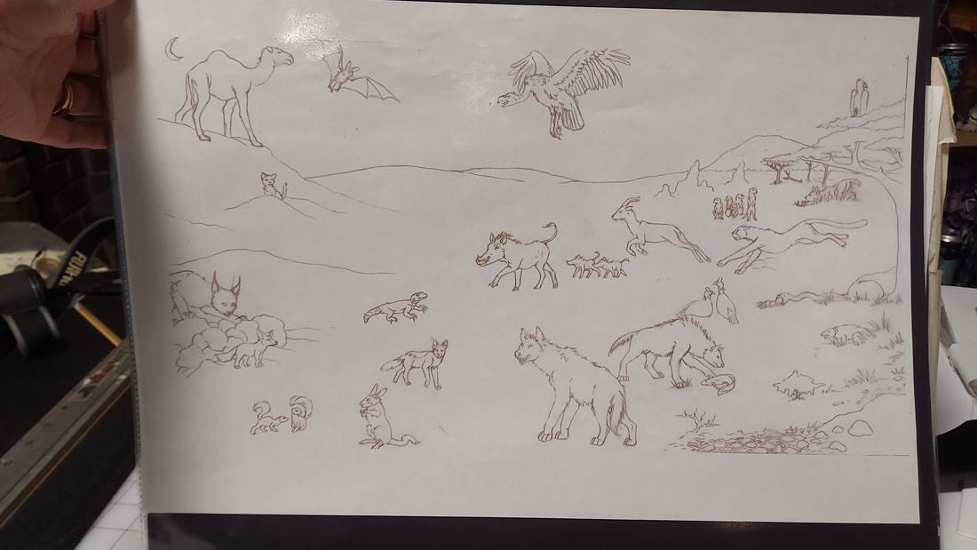
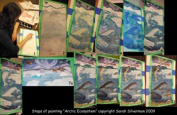
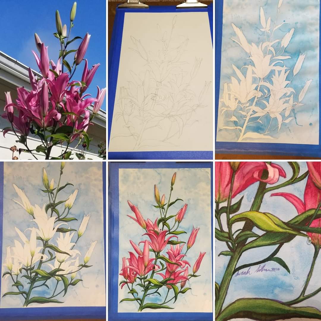
Step 6 I scanned the last image in and printed it in sepia tone, doing adjustments. Then I was able to print directly onto the watercolor paper with oil/dye-based inks and paint directly onto the line art. Step 7 I didn't take photos of my work in progress for the Africa pieces, so this image shows the progress on the Arctic piece. To finish the paintings, I brought them and my travel palette to my daily job and worked on them during my lunch hour. I started with basic washes, gradually building up color. Eventually I used blue masking fluid to block off areas I didn't want paint on. I used painter's tape for large areas. Cutting the tape to size and shape by scoring the paper was a challenge. Once I was happy with the color of those areas, I removed the masking and continued by building up layers, colors, and textures in the watercolor. Sometimes I would take a stiff brush and use water to scumble or scrub out highlights. I know that traditional watercolor is about saving the white of the paper, but I used that technique as well as white gouache and acrylic paint to add highlights. The best part was always pulling the tape off the pieces to expose the clean white edge. For the Arctic piece I did a digitally painted one as well. I still use many of these techniques in my other watercolors, though they are much less intensive. I like the clean lines and the negative space of a simple background, which can be seen in my botanical pieces. I'm very inspired by the traditional style of 18th and 19th century naturalists in the way they draw and paint plants and animals. Sometimes I add the scientific name and common name of the species. When I paint plants, I always add a water drop (or a few) since I feel that adds realism. It's also kind of become "my thing." For the lilies, I relied heavily on my reference photo, which was of a 6-foot-tall lily, a volunteer in my husband's garden. I sketched the line art directly on the sheet of watercolor paper and then pressed a kneaded eraser to it to lighten the lines. Then I did a simple loose wash of blue to represent the sky. After that, I built up layers of green for the stems. and leaves, starting lighter first. I also did some scumbling out of the highlights using yellow to add brightness and adding purple and brown to the shadows. At this point it almost looked as though I was painting white lilies. Adding the pink was fun as it's a color I seldom use. Using reds, violets, and bits of brown, I built up the layers and tried to give each petal dimension. Lastly, I scumbled out little circles for the water drops, using white paint for the highlights.
1 Comment
Leave a Reply. |
Artworks InspirationsOur artists share their experiences and inspiration with you here. Comments and questions are welcomed! Archives
June 2024
Categories
All
|
|
Follow us on Social Media:
Signup for Our Monthly Newsletter:
|
© Copyright 2024 | All Rights Reserved | Artworks Gallery


 RSS Feed